


A graphic design studio specializing in branding and brand development through strategically world-building timeless visual experiences around objects, identities, and spaces.

Pet Health & Wellness

By combining veterinary research with human-grade wellness, Dog is Human has raised the standard of pet health. While they were still developing their brand in 2022, we were hired to create a logo and packaging for their Multivitamin that reflected their commitment to dog health and wellness.
Given the in-depth research backing their brand, we knew it was important to invoke the feeling of human, innovative science within their identity. With that in mind, the product was targeting millennials who see their dog as family, and it needed to feel balanced — premium but not intimidating.
To reach our target, we took inspiration from modern supplement packaging and added playful notes, like the subtle "tail" at the end of their logo. We chose a dark amber bottle as a nod to supplements (and a genuine utility), but contrasted it with a soft light blue and contemporary fonts to make it trustworthy while still being youthful.
Dog is Human has had great success since launching, making a noticeable mark in pet health. 'Human-Grade' has since become a sought after benefit and much more available on the market.
Since launching their Multivitamin, we also helped design the packaging for their second official release — Multiflex, a powder topper for advanced hip & joint support.
Following the rules of our original packaging system, we were able to expand the visual identity across an additional SKU, utilizing a different color scheme but the same familiar application.

Hospitality, Podcast
Joiners is a podcast hosted by Tim Tierney and Danny Shapiro. They take listeners on a casual stroll through the world of hospitality by chatting with its most colorful characters. The name "Joiners" derives from restaurant industry jargon, referring to a person who joins a table where others are already eating or drinking. We sifted through vintage restaurant ephemera like matchbooks, menus, and napkins to create an identity reminiscent of 1930s Chicago steak-houses and cocktail bars. We included a collection of illustrations to use throughout their branding and for alternate segments, like Taste Test.
Brand ID + Rebrandings
Research Report
Visual Identity System
Brand Application
Brand Launch
Brand Development
Packaging Design
Web Design
Editorial Design
Marketing Campaigns
Design Consulting
Brand Building Workshops
Design Training
Research Report
Strategy & Positioning

Hospitality, Apparel
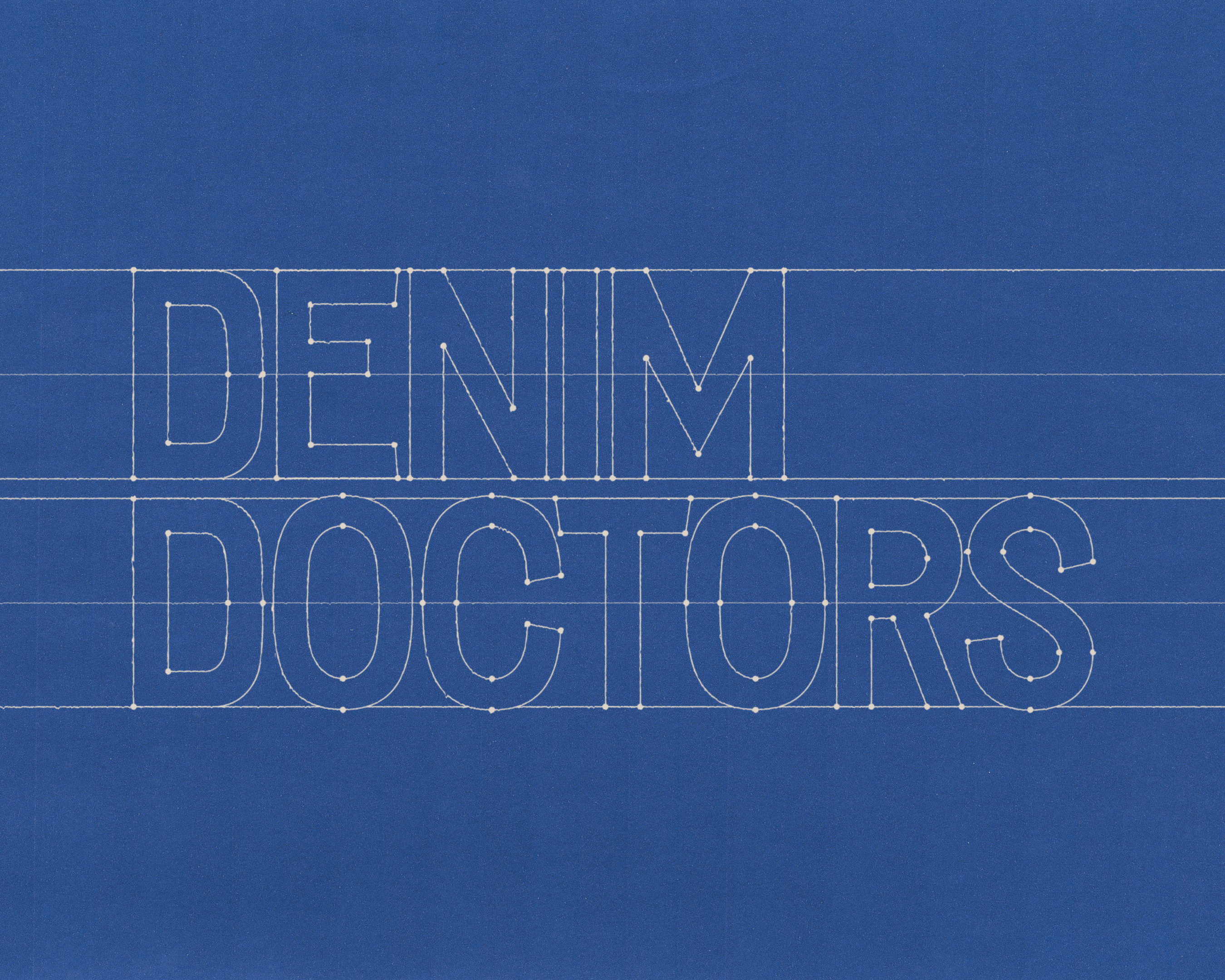
Stock was founded in 2012 as a heritage fashion brand, manufactured entirely in Chicago. After building a strong cult following, they were asked to create a custom uniform for the staff at Alinea, a world renowned restaurant. They grew to be an indispensable partner to some of the greatest hospitality establishments in the world and needed an updated branding to match. Taking inspiration from contemporary fashion and vintage Italian design, we created a recognizable, scalable brand identity to set them aside from run-of-the-mill uniform suppliers.

Manufacturing, Textiles
The visual identity of Hyperbola is built on clarity and precision. Every element follows a disciplined grid system, creating order across all formats. This structure allows information to be presented with balance and proportion, whether in small-scale applications or large environments. By adhering to these standards, the identity communicates reliability, professionalism, and timeless design.
Tenet 01
Design for the future by understanding the past.
Modern brands are more than just a logo. They're living, breathing ecosystems. We view branding as a chance to build a world around your brand. In order to create robust frameworks, we reject trends and instead use academically-informed research to design identities rooted in history and your vision of the future.
Tenet 02
Prioritize the archive over the algorithm.
Design without research is meaningless. Before each project, we conduct in-depth, academically informed research. That means digging through the archives to find historical parallels & analyzing market data to find the right approach. This allows us to solve complex challenges with critical thought, strategy, and intention rather than prescribed, trend-based aesthetics.
Tenet 03
Go down rabbit holes. Follow the magic.
We never put our clients in prescribed, trend-based boxes or deliver work that looks like everything else on the market. Our approach actively rejects this; we believe every brand requires a world of their own. Allowing the necessary time for concepts to evolve into their most powerful iteration is the prerequisite for brilliant, lasting solutions.
